 |
 |
Here are unfinished views of layouts that have some logo potential.
The examples from around the web at the bottom of this page are to use examples of things you like or don't like.
As
noted, none of the images are attempts at a "finished" look
- just a starting point for discussion. "Books, music and more"
or "Books and More" (or whatever) have not been added to any
design yet. I have a number of other ideas, and quite a few test images
to draw on, so let's talk and find what works best.
#1 - Appropriate colors and simplicity. Easy to adjust sizes from business card to web page. Easy to add and remove elements (such as shadows, lighting) before finalizing design. Classic layout of elements.
1
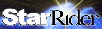
#2 - Very similar to #1 in advantages. Depending on how business cards are printed, needs tweaking for that size . Worth experimenting with other colors with this design. Giving the lettering depth/3D effects will be very effective. Semicircle element can be stretched/tweaked to be more or less pronounced. Will add six points on star for appropriate symbology.
2a
2b
#3 - Has advantages, but may need significant tweaking for business card printing unless printed in full color. Will increase emphasis of six points on star for appropriate symbology.
3
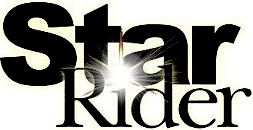
#4 - Bright star effect, classic colors. Poor layout of elements at the moment. Needs some tweaking to changes sizes. Will increase emphasis of six points on star for appropriate symbology.
4